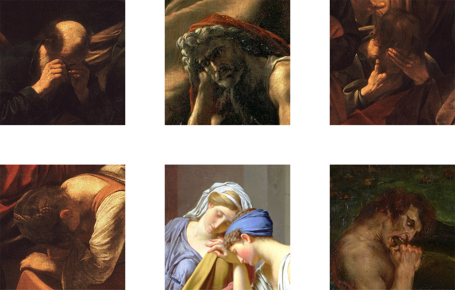
“Even the most perfect reproduction of a work of art is lacking in one element: its presence in time and space, its unique existence at the place where it happens to be.” — Walter Benjamin
Early January this year, my girlfriend and I visited Paris. We were only there for two days, and, as it was my first time in the city, our itinerary was stuffed with all of the things one feels one must do when visiting Paris — the Eiffel Tower, Notre-Dame, the Musée d’Orsay, the Musée de l’Orangerie — and, of course, the Musée du Louvre.
The Louvre is the archetypal museum — when one thinks of a museum, one thinks of the Louvre. The place itself — those stark glass pyramids against the ornamented buildings that surround them — is a symbol of art as much as the pieces contained within it are. Whilst the Orsay has a more interesting collection, and the Orangerie is more serene, it is the Louvre which seems to say “You are now Looking At Art.”
There is, however, one piece of art in the Louvre which says this more so than the building itself — Leonardo’s Mona Lisa. Say the word “art” to an eight-year-old, she will likely think of this painting. It has been reproduced ad infinitum — if I were discussing any other painting, I would now place an image of it into the post: with the Mona Lisa, there seems no point.
Upon arriving in Paris, we dumped our bags at the apartment in which we were staying, and immediately made our way to the Louvre. We were eager to Look At Art.
In the main hall of the Louvre are entrances into the various wings of the museum, each labelled with names that gave little away as to what was within. We could have found ourselves a map and navigated the place sensibly, but we let chance guide our visit — we picked a wing at random, and wandered in. There wasn’t much in particular that we wanted to see at the Louvre — aside from the Mona Lisa, that is.
The wing we found ourselves in contained the Louvre’s ancient Egyptian collection — a fascinating exhibit, but we found — after about an hour — that there are only so many sphinxes, sarcophagi & eye-hieroglyphs that one can see on any given day, and we returned to the main hall.
Starting to feel hungry, and still tired from the flight over, we decided we’d go see the Mona Lisa, whatever pieces we encountered along the way, and then leave.
Not wanting to leave it to chance again, my girlfriend went to the information desk to find out which wing the Mona Lisa was in. Not only were we told which wing, but which floor, and where to go on that floor. Easy — we’d make a beeline for the piece, and then go grab some food.
Once in the appropriate wing, we began to see signs leading us towards Leonardo’s masterpiece. Even easier. Just follow the signs — we’d be there in no time.
However, each sign seemed to lead only to another sign. And then another. Soon, we were back where we started. And then we found that the signs contradicted each other. This one says left, but that one before said that it was right. Is that one pointing downstairs, or just to the left? I’m pretty sure this sign is pointing towards an emergency exit.
By this point, we had probably been looking for half an hour. We’d seen lots of nice art along the way, but now, it was starting to feel like every painting we saw was of us — each face painted centuries ago to reflect back at us our frustration and desperation.
In my tired, hungry, angry-at-the-Louvre state, I began to wonder — what if she isn’t here? What if that’s the point? Maybe there’s a great worldwide conspiracy and we’re now the latest to learn of it — that the Mona Lisa doesn’t exist. She exists only as reproduction. There is no original.
I knew it was a fanciful idea, but decided to follow it nonetheless. The Mona Lisa that we think of is not the one that hangs in the Louvre anyway. We are fascinated by the reproduction — by the fame that that reproduction brings. The real Mona Lisa — however masterful it may be — is just a painting. The only reason people want to look at the original — the reason that people fly halfway around the world just to see it — is in the hope that this experience will allow them to see the reproduction in a new way.
Where once it was a painting of a woman with a slightly odd smile, now it is no such thing at all. It has ceased to be a painting of a woman, and has become a painting of itself.
I might go one further — the Mona Lisa is now not even a painting of itself, but a painting of art in its entirety. It is a symbol for the institution that promotes genius as a commodity, that turns a thing of beauty into a thing that one must “understand”, that has made this 77 × 53 centimetre poplar board coated in oil paint worth more than, well, just about anything.
In 1911, the Mona Lisa was stolen by Louvre employee Vincenzo Peruggia — it sat in his apartment for 2 years before being found and returned to the museum. Throughout those two years, people still flocked to the Louvre to gaze at the blank space of wall where the Mona Lisa had once been. Billy Parrott suggests that it did not matter to those who went to see it whether the painting was there — everybody had seen its reproduction countless times before. What mattered was people being seen looking at it:
People standing in line, looking at an empty space on the wall. People looking at other people look at the empty space on the wall. Everyone knowing what should be there. Everyone knowing exactly what the thing would look like.
All this is not to say that there is no value in seeing the original Mona Lisa — there is, but to get to that value, one has to strip away all of the myth around her — what John Berger would call “bogus religiosity.” Instead, we have to learn to see the painting as simply that: a painting. A woman, as seen by a man, in a culture very different from our own. A man, trying to share with others that which he saw as beautiful.
Eventually, we found her. There she was, on a wall all by herself — the Mona Lisa. The original. A wall of bulletproof glass surrounded her, and a wall of tourists surrounded that. People shuffled around, trying to get closer to her, spending more time looking at their own personal reproductions of the painting in their phones that at the painting itself. They (and also we) were focused not on the Mona Lisa, but on how, by reproducing it, they would be seen by others as having looked at it. In the end, the Mona Lisa was in the Louvre — but maybe we weren’t.
Today, I woke up to a new world. We all did. I ate the same breakfast, walked the same commute to work, but the sense that things were very different now — a deep, silent, aching cry — sat solemnly in my stomach.
I awoke to feel a profound division within our society — a fissure which I’d known existed, but which only now could I truly sense, so wholly & so vividly. Donald Trump’s election into office was, of course, what caused me to feel this today, but that was just the latest in a series of events which have emphasised so clearly our deeply fractured world. I awoke to a similar feeling on the day after the UK’s EU referendum. That sensation arises again each time more innocent people are killed by the police. Each time, it is a struggle to remind myself that it is not a matter of us vs. them, no matter how much it may feel that way.
A community is a place in which people face each other over time in all their human variety: good parts, bad parts, and all the rest. Such places promote the highest quality of life possible — lives of engagement and participation.
The divisions that I feel in the world are clearly felt by so many others — and for lots of people, they are not just felt, but lived out. Today, my social media feeds have been awash with people crying out for ways to foster a sense of community and togetherness — something that right now feels so far away.
Community. It’s a word that’s everywhere right now, but a feeling that is very distant.
Reading Austin Kleon’s notes on John Taylor Gatto’s Dumbing Us Down, I was struck by the very clear distinction Gatto makes between networks and communities. Communities, Gatto says, are places that expose our humanity, in all its forms, whilst networks only take the bits of ourselves that they need, in order for the network to function:
Networks divide people, first from themselves and then from each other, on the grounds that this is the efficient way to perform a task. It may well be, but it is a lousy way to feel good about being alive. Networks make people lonely.
One of the strongest sentiments following the election result — one that follows almost every election result — is that sense of detachment from the other side. Our social media channels are filled only with people who agree with us. We hear of those who disagree, but filtered through the distorted lens of the media, or anonymised into poll samples — so rarely do we interact with them in a meaningful way.
Gatto is writing before social networks, before the internet, and yet his ideas feel all the more prescient because of them. He is writing about real-world networks — schools, companies, chess clubs — but social networks are built upon the same structures: they take the parts of ourselves that they need, and present them as if that were the whole. They split us up based on who we are and what we believe, with little thought as to the consequences of these divisions. We are now seeing those consequences.
If we are to turn this tide — to make people feel safe and welcome within their own countries — we need to think less in terms of networks, and more in terms of communities. How do we turn the systems in our lives — both online and off — into ones which open us up to more people — to wider perspectives — rather than closing us off into our own?
Networks are an important part of our society, don’t get me wrong, but it’s just starting to feel like that’s all we’re capable of creating. Where are the systems that erase boundaries, rather than putting new ones up? Systems that blur the lines between work and play, between productivity and idleness, between sincerity and humour, rather than enforcing them?
We’ve got enough divisions within our society right now. We’ve drawn enough lines. We need to start thinking about how to build up communities that rub those lines out. How do you forge a community that brings together people who would never normally interact? How do you build a community that constantly introduces its members to ideas that contradict and challenge their own? And how do you do this whilst still making these communities safe, welcoming places?
I want to repeat this until you are sick of hearing it. Networks do great harm by appearing enough like real communities to create expectations that they can manage human social and psychological needs. The reality is that they cannot. [They will] ultimately produce that odd sensation familiar to all city dwellers of being lonely in the middle of a crowd.
That feeling — of being lonely in the middle of a crowd — is one that will ring true for a lot of us today. It’s easy to feel that this is a vote against you. That the rest of the country has decided you’re not welcome, that you don’t deserve to be listened to.
You do. We just need to create the communities that will listen.
This piece originally appeared in Discourse, but I am reposting it here for posterity.
I am five years old, sitting in the kitchen with my mother. She has just spent half the day baking a lemon drizzle cake, which now sits on the rack in front of me, cooling. It’s a vegan lemon drizzle cake, she tells me repeatedly. For vegans. It’s a thing she is trying out.
I, she reminds me, am not a vegan. This cake, she is keen to emphasise, is not for me, because I am not a vegan.
And yet…
It’s sitting there in front of me. Moist and warm, steam still seeping out its gently-cracked top. I’m sure all the vegans are going to enjoy eating this very-definitely-vegan cake.
Brrrriiiiiiiiiinnnnngggg.
The phone rings in the other room.
Brrriiiiiiiiiiiiinnnnnngggg.
My mother tears off her rubber gloves and rushes out of the room, to answer the call.
She returns a few minutes later. I have, in these few short moments, moved out of my seat, and am sat on the table. A giant piece of the lemon drizzle cake sits in my hand, an even larger chunk in my mouth. Crumbs lie scattered around the kitchen, like debris after a hurricane. The cake is in ruins.
“Conor! What have you done?”
My mother, understandably, is not pleased.
I look up from my unplanned mid-afternoon feast with a glint in my eye. I know something that she does not. She thinks I’ve done something wrong, but once I explain myself, she will see that I am wholly in the right.
I explain, with my mouth still stuffed full of delicious lemon drizzle cake, “I— I’ve decided that I’m a vegan now.”
We do not become the people we are out of choice, but out of chance, and necessity. A particularly interesting lecturer in a class we accidentally walk into. A parent’s keen interest in astronomy. A tantalising lemon drizzle cake on a table we just happen to be sitting at.
When we talk about our origins, we are not talking about ourselves and the decisions we’ve made, but about everything else — all the other things that shape us. Our families. Our friends. Time. Place. The significant milestones and the everyday nothings.
Understanding somebody’s past is the easiest way to understand who they are today. These are the things that have had the longest to grow into a person’s identity — the parts of ourselves that are most deeply-rooted. We ask where somebody is from, or what the first record they bought was, in the hope that it will reveal their whole self to us. Closely observed, somebody’s origins become a shorthand for their entire life.
But the past, it is important to remember, is malleable. Whilst our origins inform the rest of our life, it is the rest of that life that informs how we perceive those origins. Stories are passed from person to person, between family members, then across families — eventually, it can be hard to decipher just what of our past is memory, and what is story. Perhaps it wasn’t a lemon drizzle cake at all — I remember it as such, but at the age of five, it is unlikely I would have know the difference between lemon drizzle and a Victoria sponge. I remember it as a lemon drizzle cake because my mother’s lemon drizzle cake is affixed so firmly, so vividly, to my memory of childhood. If I place another cake in that story, it no longer feels like a story of my childhood. The memory of a past, perhaps, reveals more truth than the actual facts do.
This essay was written as a university assignment whilst studying at Bath Spa University. It is not written to be read on the web, but I have adapted it to work as best it can on here. If you want all the references and a bunch more images, check out the original version as a PDF.
All media shape our society; introduce new ways for us to see the world — new ways to think about our surroundings. Similarly, our media are shaped by our society – they are a reflection of our values, our technology, and our hopes for the future. The automobile, for instance, was born out of a need for more efficient transport in the wake of rapidly-expanding cities — its popularity led to the rise of suburbia, the decline of streetcars, and the development of a massive concrete network that now governs our landscape.
What, then, of the typeface? A medium than spans almost every other, its reach is wide, and yet it often lies unnoticed, overpowered by the content it presents. Do our typefaces shape society, or do they simply reflect it? They are the artefacts of our cultural push-and-pull between technological advancement & humanity, but they might also, it seems, be a driving force behind that battle.
To Boldly Go: The Sans-Serif & Industry
The rise of the sans-serif in the 19th and 20th century has, in many ways, shaped the face of today’s graphic design more so than any other development in design: By becoming the face of industrialism, it brought design kicking-and-screaming into an industrial world too.
Though today, the sans-serif is seen as the epitome of modernity and futurism, the opposite was true when it first arose. The first sans-serif fonts, around 1780, (as opposed to the first sans-serif letterforms, which date back millennia) arose as a result of neo-classicist sentiments that permeated Britain in the late 18th century. These early sans-serifs were influenced by classical principles of form, and as such were monoline and all capitals, evoking engraved typeforms.
The sans-serif form was neither well-liked nor popular in the 18th or 19th century, though they were in favour amongst sign-painters, for whom the forms were easier & quicker to reproduce than serif forms. In August 1805, European Magazine wrote of the “old Roman letter”:
The warmest advocates of these letters cannot but allow, that they are clumsy in the extreme, and devoid of a single beauty to recommend them, or any thing whatever, except their antiquity.
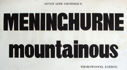
Its lukewarm reception — and poor adoption — was partially for technical reasons: Quite simply, no sans-serif font had lowercase glyphs — after all, the fonts were derived from ancient majuscule forms. The first sans-serif to have a lower case was Grotesque, an 1834 condensed sans from William Thorowgood. Over the rest of the 19th century, the sans serif would creep into the libraries of print shops, used primarily for industrial & commercial projects; never deemed appropriate for book design. Though this would be the foundation of the sans-serif’s role within industrialisation, the sans-serifs of the 19th century were still decidedly human — they bore none of the sharp geometry or sombre neutrality which would make the sans-serif so suited for the machine-generated world of the 20th century. Instead, these early sans-serifs carried more personality — terminals that stopped at odd angles, claustrophobic counters that gave the forms no room to breathe, and contrasts between horizontal & vertical strokes more akin to those of serif typefaces than of today’s sans-serifs.
The turn of the 20th century proved to be a pivotal time for the sans-serif, with the release of several typefaces which would shape the aesthetic of the sans from then henceforth, the most notable of these being Akzidenz Grotesk (1898) and Morris Fuller Benton’s series of American “gothics” – Franklin Gothic (1902), Alternate Gothic (1903) and News Gothic (1908). Unlike previous sans-serif fonts, which were ultimately forgotten to dusty printers’ cabinets, these fonts are still available — and popular — to this day: An indicatin that the form was, in these fonts, close to perfected.
The emergence of the turn-of-the-century sans coincide with advances in industry — 1901 saw the first assembly line, which would pave the way for a century of mass-production and mechanisation. These fonts, particularly Akzidenz Grotesk, feel closer to this spirit of industrialism than previous sans-serifs do — their angles more constant, their counters more open. They still keep a very tangible sense of humanity, however — a humanity that would later be lost in the geometric typefaces of the 1920s and 1930s. “Akzidenz” itself translates to “commercial” or “jobbing” — evidently, the sans-serif and industry were, at that point, inseparable.
Benton’s Gothics wear their humanity on their sleeves more so than Akzidenz Grotesk, but even they feel vastly more mechanised than the grotesques that preceded them. Society’s tendency towards industrialisation is far more evident in these fonts than those before them, and this ever-increasing tendency would continue to be reflected in design — and specifically, in type design — reaching a peak with Futura (1927), the pinnacle of mechanisation within typeface design.
Though the impact of industrialism on the sans-serif is evident, the impact of the sans-serif on industrialism is even more striking. These fonts would provide a vessel for the machine to merge with the most human medium of all — words. By separating language from the humanity of hand-lettering, serifs & blackletter, and combining it with the more mechanical sans-serifs, designers of the early 20th century gave people a way into industrialism – A way to connect with it, and, ultimately, a way to accept it.
At the heart of this was the idea of a machine aesthetic, and how closely it aligns with the aesthetics of the sans-serif – Lewis Mumford describes this aesthetic as “elimination of the non-essential.” Brent C. Brolin writes:
[Machines] performed their tasks simply and efficiently. The aesthetic qualities of the machine — simplicity and geometry — became desirable in themselves.
This aesthetic is echoed strongly in the aesthetic of the sans-serif: the non-essential serifs were eliminated, and the designs were imbued with a strong geometry — greater use of straight lines and right angles, and increased consistency between letterforms. By increasing uniformity, the letters became interchangeable and the font became less a design, more a system. The font became a machine — not a machine stored away in factories, but a machine shown to the public wherever they looked. The font became the poster boy, quite literally, of industry.
Marshall McLuhan theorises that the impact of a medium comes from the medium itself, not what it communicates:
The content or message of any particular medium has about as much importance as the stenciling on the casing of an atomic bomb.
The impact of these early sans-serifs, however, is related directly to the content, and how they could be used to offset the messages they were communicating — messages of objectivity. Alone, these instructions & directions — these mechanical dicta — would be cold and unwelcoming, but with the subtle humanity of the early sans-serifs, they could be given life. In The Crystal Goblet, Beatrice Warde submits the idea that:
Type well used is invisible as type, just as the perfect talking voice is the unnoticed vehicle for the transmission of words, ideas.
However, for early sans-serifs to be the “perfect talking voice” for industry, it could not be invisible, but it had to lend its own voice to the conversation — one of authority, but of understanding. One that looked to a mechanical future, but kept one eye on the humanity in the rearview mirror.
Borne Back Ceaselessly: The Script & Our Search For The Hand
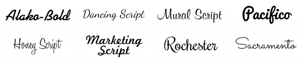
If 20th century typography was about surrendering our humanity to machinery, 21st century typography is about reclaiming it. The re-emergence of the script in the late 2000s/early 2010s came at a time when digital technologies had become all-encompassing — our world was Web 2.0; it was glossy and well-maintained and soulless. The “retro” aesthetic was a counterblast against that culture, and with it brought a glut of new script fonts, each reminiscent of a bygone era where our designs were crafted not by code, but by hand.
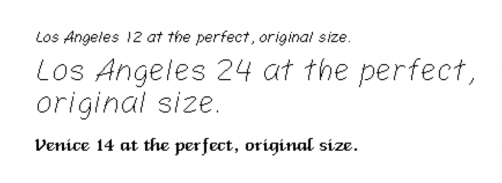
It is perhaps ironic, therefore, that these scripts came as a direct result of the advances in technology — It was really the first time that scripts could effectively be used as digital fonts. Because of low screen resolutions, the first computers had only bitmap fonts — fonts drawn on a pixel-by-pixel basis, as opposed to today’s vector fonts which render shapes from mathematical expressions. Bitmap technology simply didn’t suit script fonts, though that didn’t stop designers from trying — two of the fonts included on the first Macintosh could be loosely classified as scripts: Susan Kare’s Los Angeles and Bill Atkinson’s Venice.
With the introduction of the sub-pixel rendering engines CoolType & ClearType in 2000, vector fonts became far more usable, but by that point, scripts simply weren’t in demand: the aesthetic of the time was already a digital one — one that looked to the future — and scripts reeked too heavily of the past.
The web was also a sticking point for the script, though it ultimately proved to be its saviour. Prior to the arrival of fast and secure font-embedding technologies on the web, the only fonts that designers could use for websites were those that the user would have on their computer. With different platforms being loaded with different fonts, the selection of “web-safe fonts” was extremely limited: a handful of sans-serifs; a couple of serifs; Courier New & Comic Sans. It was only once font-embedding became possible that script fonts could flourish on the web, but it was precisely for that reason that they did flourish — with the new freedom to use any font they wanted, designers rushed for the fonts that had most eluded them on the web: scripts.
The script’s revival may also have had an economic basis — scripts were particularly profitable for type designers. Unlike other typographic styles, which had been fonts for decades before digital typography, scripts had always been the work of calligraphers, letterers and sign-painters. They were unique to the those who rendered them, and as such, there were no classic script fonts. When the demand grew for script fonts in the late 2000s, the market was underpopulated, and thus a very attractive proposition for type designers. Scripts are also cheap and quick to design: As they’re not used in body text, they do not require multiple weights & styles, and their hand-generated heritage makes them more forgiving towards imperfect Bézier curves and offbeat letterforms. By that point, with the introduction of online marketplaces and consumer-level font-generation software, type design was well-and-truly democratised, and a flurry of script fonts flooded the market, ranging from the beautiful & innovative to the ugly & utterly unusable.
Though the technical advancements are certainly significant, they do not answer one important question — why scripts? And why this particular brand of 50s Americana scripts? The revival could just as easily been of blackletter fonts, or handwriting fonts, so what was it that caused the return of these saccharine sign-painter scripts? The answer, it would seem, lies not in the technology, but in the culture.
Culture always has a tendency to look to the past: From the neo-classicism in the 18th century to punk’s revival of the greaser look in the 1980s, our cultural history constantly informs our future. Elizabeth E. Guffey posits that this retrospective tendency is a form of Postmodernism:
The attributes of retro, its self-reflexiveness, its ironic reinterpretation of the past, its disregard for the sort of traditional boundaries that had separated ‘high’ and ‘low’ art, all echo the themes found in Postmodern theory.
When the status quo looks to the future, the avant-garde look to the past. This specific retro craze came after a period of economic development in the West, which suddenly came crashing to its knees in 2008. As the once-bright future dimmed, we searched for brightness in the past. As Guffey writes:
The retro past is […] implicitly linked with loss of faith in the future.
What made this particular period more significant than most was that it came at the same time as other cultural developments that complemented it: The rise of the hipster, the revival of a DIY/craft aesthetic, and mass-gentrification created thriving retropolises, and, in turn, a profitable market for retro design.
But script typefaces were not adopted solely by the counterculture — they quickly became popular in corporate branding too (think MailChimp, Airbnb, Bitly.) Unlike pre-existing script logos (Kellogg’s, Coca-Cola, Old Spice), these brands were not designed to communicate heritage or tradition — instead, they communicated a certain humanity and a “we’re-all-in-this-together” sentiment. If turn-of-the-century sans-serifs were primarily mechanical, with a faint whiff of humanity, then modern scripts where primarily human, with a faint whiff of the machine.
Our culture’s obsession with technological advancement had brought us so close to the precipice of a fully-mechanised aesthetic that we had begun to lose sight of the humanity within design. The hand, which had been such a vital part of the design process before, had been replaced by the cursor. These script fonts gave us back the sense of the hand — they gave a personality to the pixels that displayed them. The messages they communicated were still mechanical ones, but the fonts that communicated them told a different story — a story of mistakes, of manual labour, of excitement. The fonts were often gaudy, sometimes overplayed and usually illegible, but more importantly: they were personal.
What caused script fonts to fall out of fashion, however, was the same reason that caused them to come into it — their humanity. A script’s most important feature is its individuality — no other hand could have created that work. A font, however — by very definition — is designed for mass-production and mass-distribution. Certain script fonts — most famously Wisdom Script, Bello & Lobster — became grossly overused, due to their affordability, legibility & versatility. Quickly, these fonts lost their individuality, and grew to reek of inauthenticity, a stark contrast to the authenticity that had plunged scripts into popularity in the first place.
The remnants of the script revival still echo around the design world today, but for the most part, designers have reverted to clean lines, solid colours and geometric sans-serifs. Scripts are certainly not yet dead — they still lie scattered around bestselling font lists at the end of each year — but they appear to have lost the authentic voice that they began with, overrun by corporate zeal just as the retropolises that homed them have been.
Extensions of Man: Typeface As Medium
To truly understand the significance of typefaces, and their effect on society and technology, it is important to see the typeface not just as a design, not just as software, but as a medium. A medium through which other ideas are spread, but also a medium through which the ideas of the typefaces themselves are spread. Marshall McLuhan defines a medium as:
Any technology whatever that creates extensions of the human body and senses, from clothing to the computer.
He theorises that the wheel is an extension of the foot; the book an extension of the eye; clothing an extension of the skin. The typeface, then, is an extension of the voice — it allows us to talk in new ways; expressing nuances that the human voice can not. It reveals truths not present in the words alone.
Where the typeface differs from the voice is that it acts within a visual space, whilst the voice lies in an auditory space. The crucial difference here is that:
The auditory field is simultaneous, the visual successive.
Our culture has become so immersed in the visual space that we are more attune to it — we are more receptive to nuances in the visual than in the auditory space. As such, our voices can be better heard through typography, and the changes it can make to society are more dramatic.
If the typeface truly does effect change as much as its content, what, then, is the change that it effects? It provides new paradigms through which to see things. It provides a human voice in a sea of technology, or a mechanical voice as a gentle warning of things to come. Used correctly, the typeface makes incomprehensible content understandable, or forces the reader to spend more time over that which they may just skip over. By changing the way we look at words, the typeface, in a very subtle way, changes the way we look at the world.
Different typefaces, however, have different effects, much of which is down not to aesthetics, but to the level of engagement. McLuhan categorises media into two subsets — hot and cool:
A hot medium excludes and a cool medium includes; hot media are low in participation, or completion, by the audience and cool media are high in participation. […] A lecture […] is hot, but a seminar is cool; a book is hot, but a conversation […] is cool.
In the case of typefaces, the sans-serif and the script sit at the two ends of that spectrum: The sans-serif is hot; the script is cool. The sans-serif is designed for legibility — it takes no effort for us to read. Indeed, we have learned to do so without thinking. We need not engage in the medium in order for its message to be communicated.
The script, however, demands participation — we must first process the letterforms before we can parse the content contained within them. Scripts lack the conventions that bind sans-serifs together, and as such, are a more laborious medium. Indeed, this is why scripts and sans-serifs work so well together: They create rhythm — An ebb and a flow.
McLuhan hypothesises that the cool medium will always give way to the hot eventually: The stone tool gives way to the metal tool; the painting gives way to the photograph. As we advance further into civilisation, and away from tribalism, we create media that hinder progress as little as possible. So it was with letterforms — the script gave way to the hotter serif, which in turn gave way to the hotter-still sans-serif. The return to the script echoes a desire to return to tribalism in the wake of a Capitalist system that had failed so many.
By applying McLuhan’s ideas to typefaces, we can see a greater societal pattern begin to emerge — a constant tension between technological advancement and humanity; the push of civilisation against the pull of tribalism. This battle is not just reflected in our typefaces, but influenced by them too — the typeface acts as an entry-point into each world; a door beckoning the reader into a way of seeing.
As designers, it is important for us to see this change, and react to it. Our work lives within a cultural battleground, and neutrality is not an option. As McLuhan puts it:
Inherent in the artist’s creative inspiration is the process of subliminally sniffing out environmental change. It’s always been the artist who perceives the alterations in man caused by a new medium, who recognizes that the future is the present, and uses his work to prepare the ground for it.
Our designs, in some small way, mould the futures into which we bound. Collectively, they create a culture which shape how humans think, how they act, and how they, in turn, create. These designs need no permission from us to do this — indeed, we can not stop them. But by recognising the impact of design in the past, we may be more considered in what we put into the world, and just what we want our future to look like.